America’s wealth inequality has worsened over the years and currently is as extreme as it’s ever been. If the “playing field” was level, the distribution of wealth should look very different – a much larger percentage of smart, motivated, educated, hard-working people who currently are struggling would be much better off.
Demonstrably, the “rules of the game” by which we all operate in this nation continue to skew the wealth in ways that are patently unfair to the vast majority of Americans. Huge tax breaks disproportionately benefit the wealthy; national and local budget deficits drain our collective wealth and when the bill eventually comes due, the societal effects will likely impact the poor and middle class more severely than the wealthy, whether it be through curtailment of government programs that strive to level the field, or through the overall damage to the society that will undoubtedly come as these structural inequities are corrected.
A number of illustrations of this increasingly unfair situation are out there, but none is quite as eye-opening as the slices-of-the-pie analogy. The fact is that even though we all know there’s a problem, it’s much worse than most of us think. The following video tells the tale of a survey of 5,000 Americans where a Harvard economics professor asked them how skewed they thought the wealth distribution in the country is, what they thought it ought to be, and amazingly, what it really is. You might find it interesting!
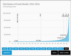
And you might find these interactive charts of interest. Note that they present the information in 1963 dollars. The $10M in 1963 dollars at the right of the particular graph below would be more than $80M in 2016 dollars.
(Note that these charts are interactive – comparing just two data points, the wealth of the 50th percentile and the 95th percentile for 2007 and 2010 shows a 39% decrease at the 50th percentile and a 10% decrease at the 90th percentile.


